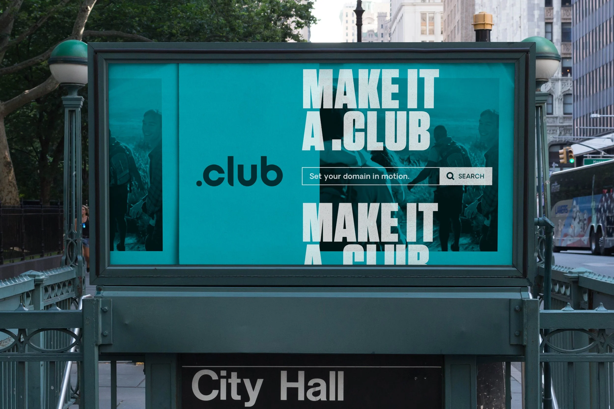
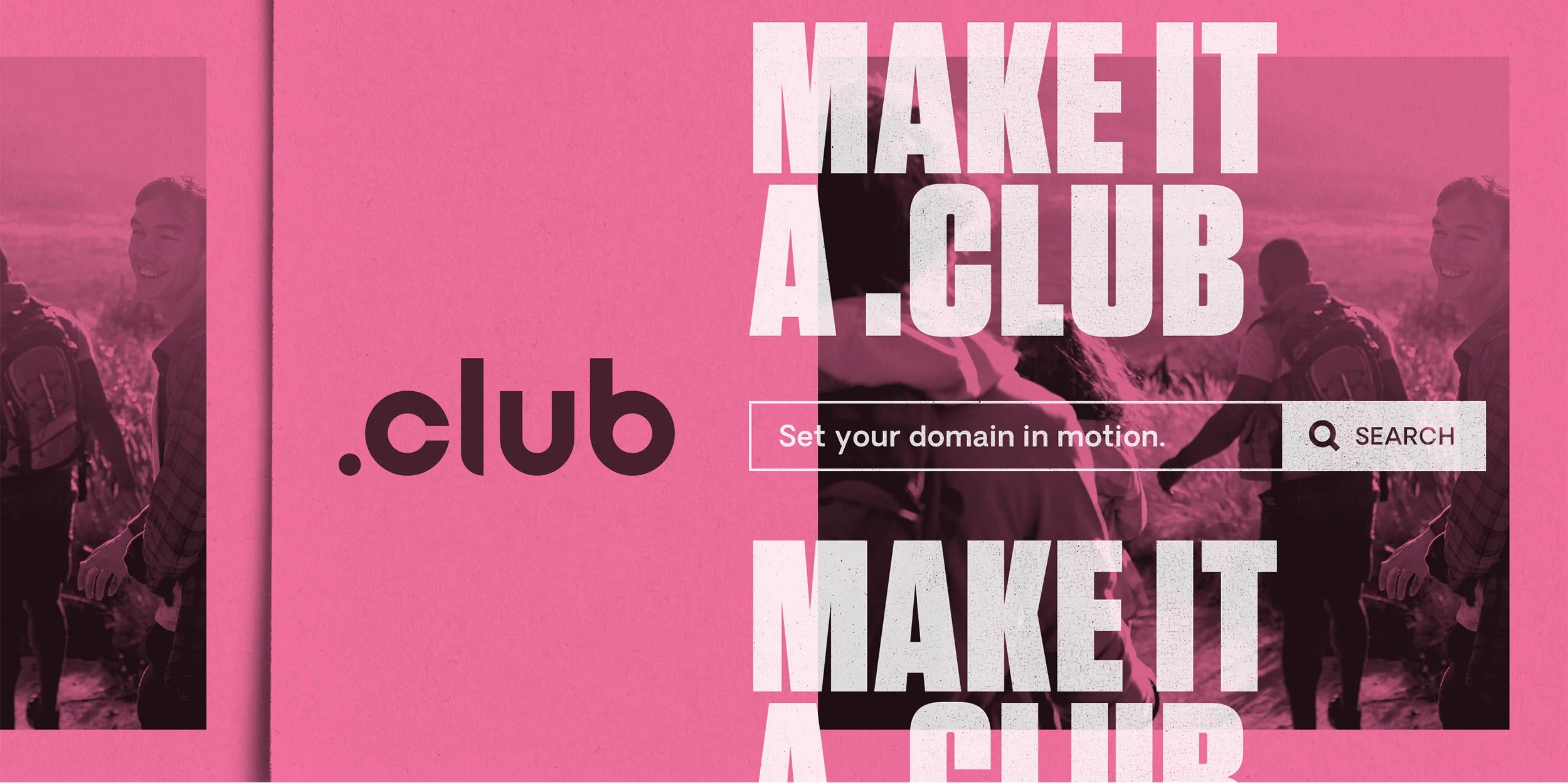
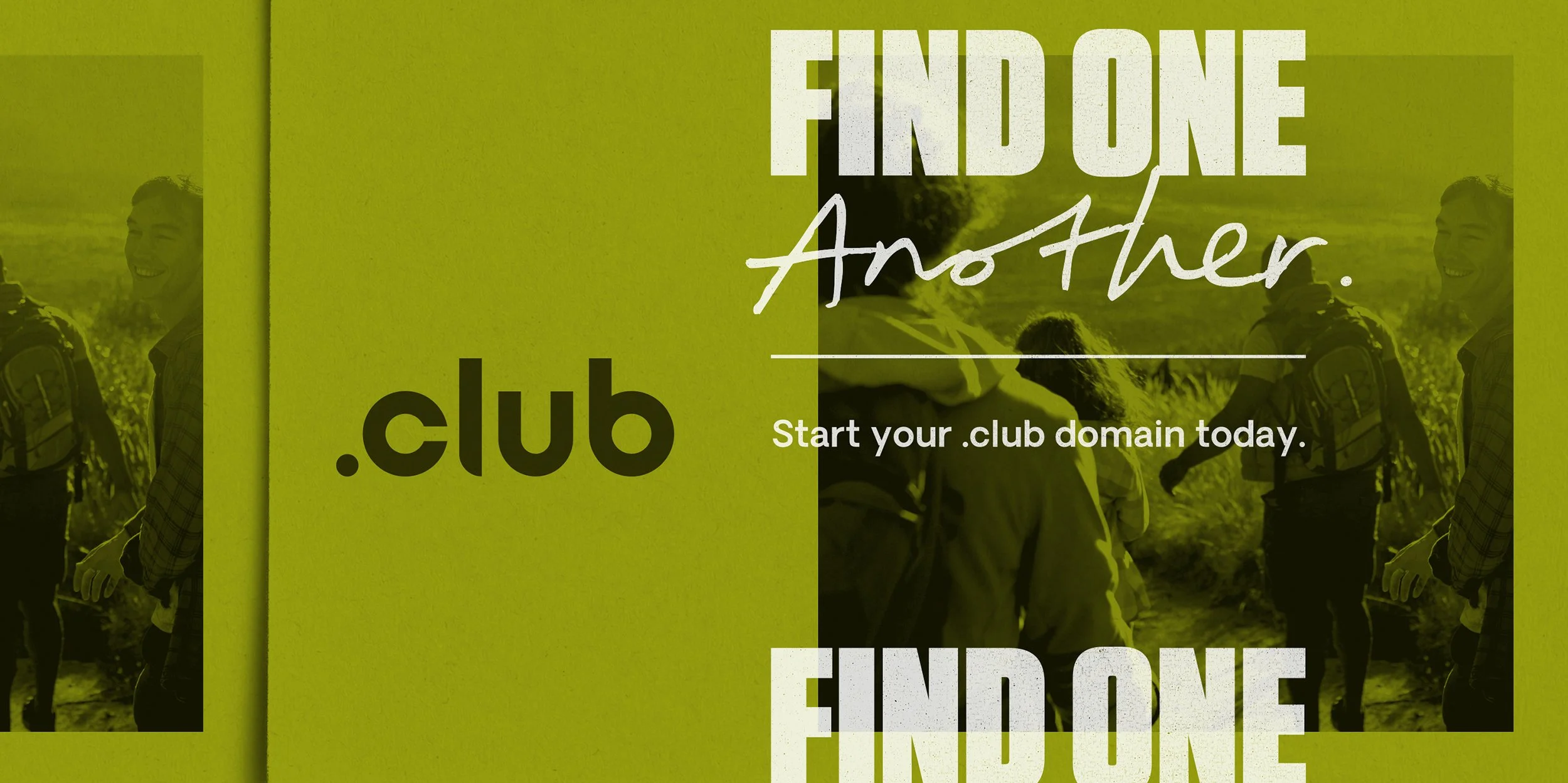
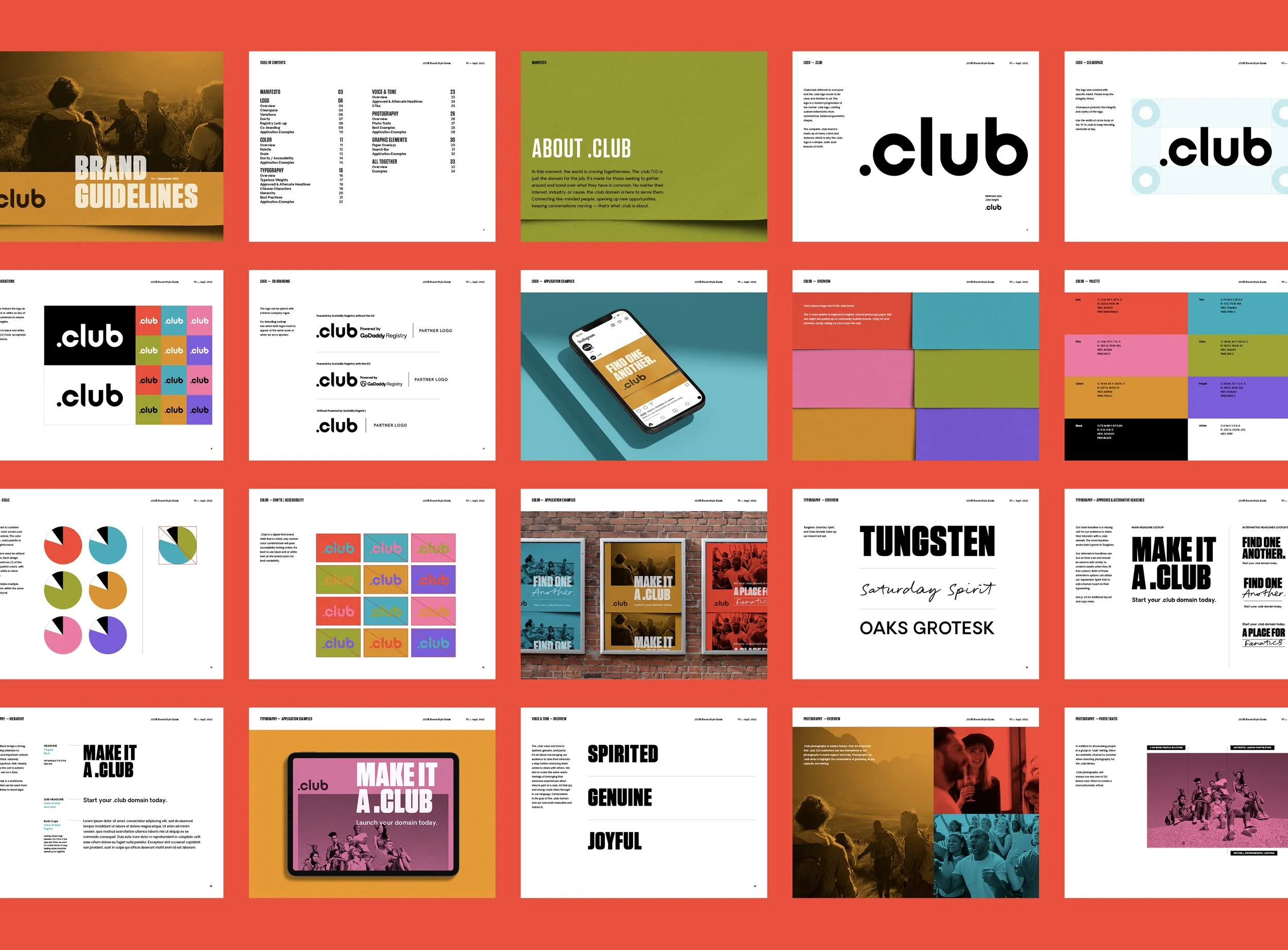
GoDaddy brought me in to help define and expand the identity for their .club top level domain. The goal was to build a flexible brand system centered on one core idea: community. .club is for people who want to gather around shared interests, causes, industries, or obsessions and build something together.
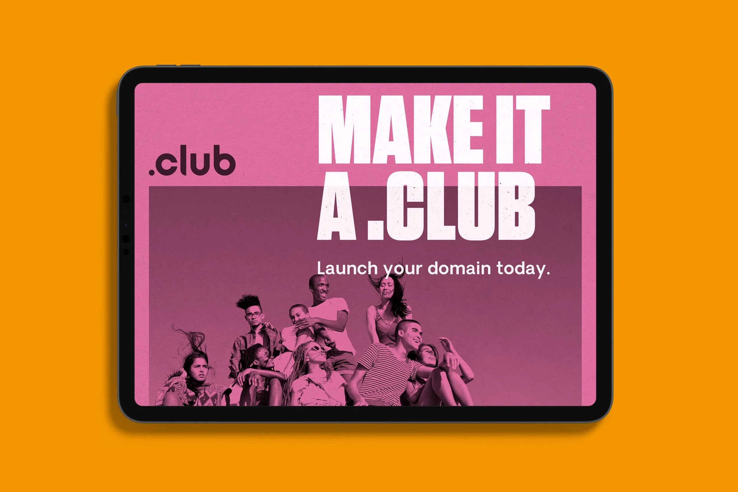
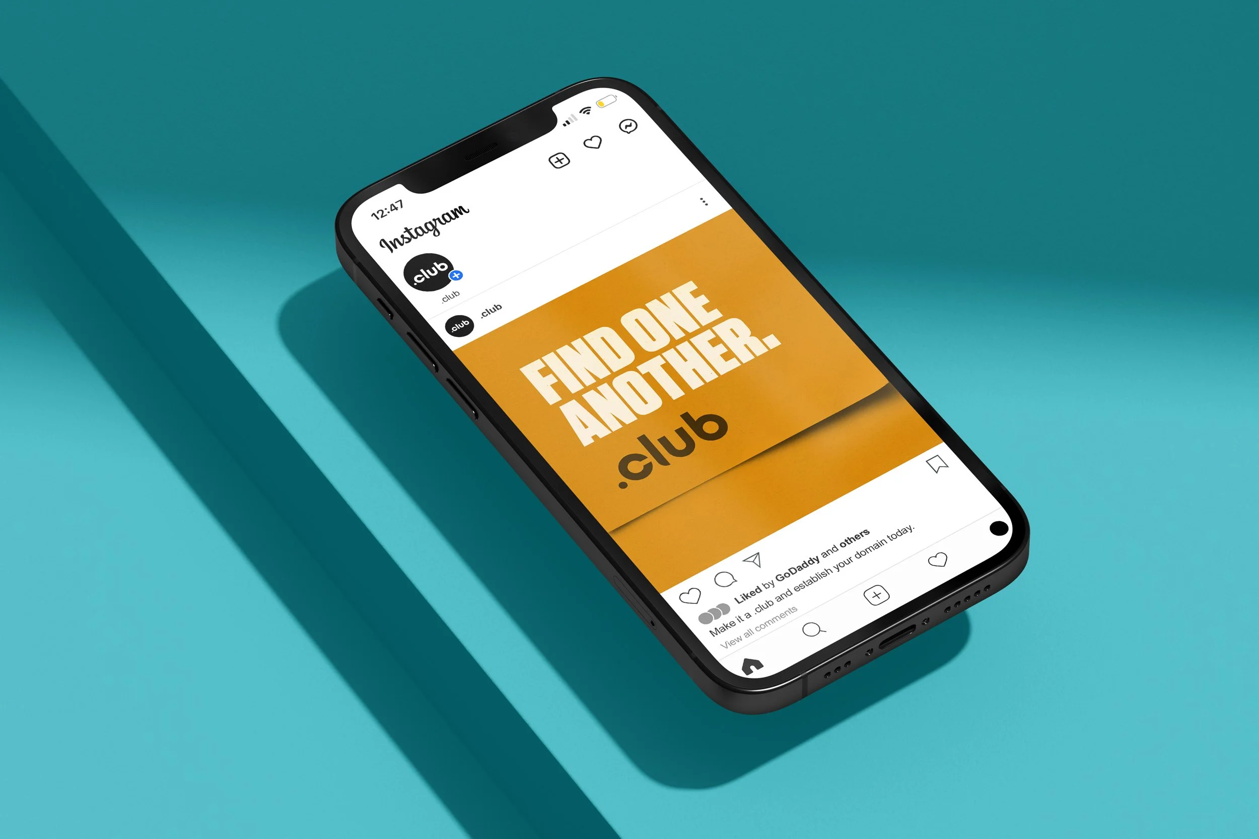
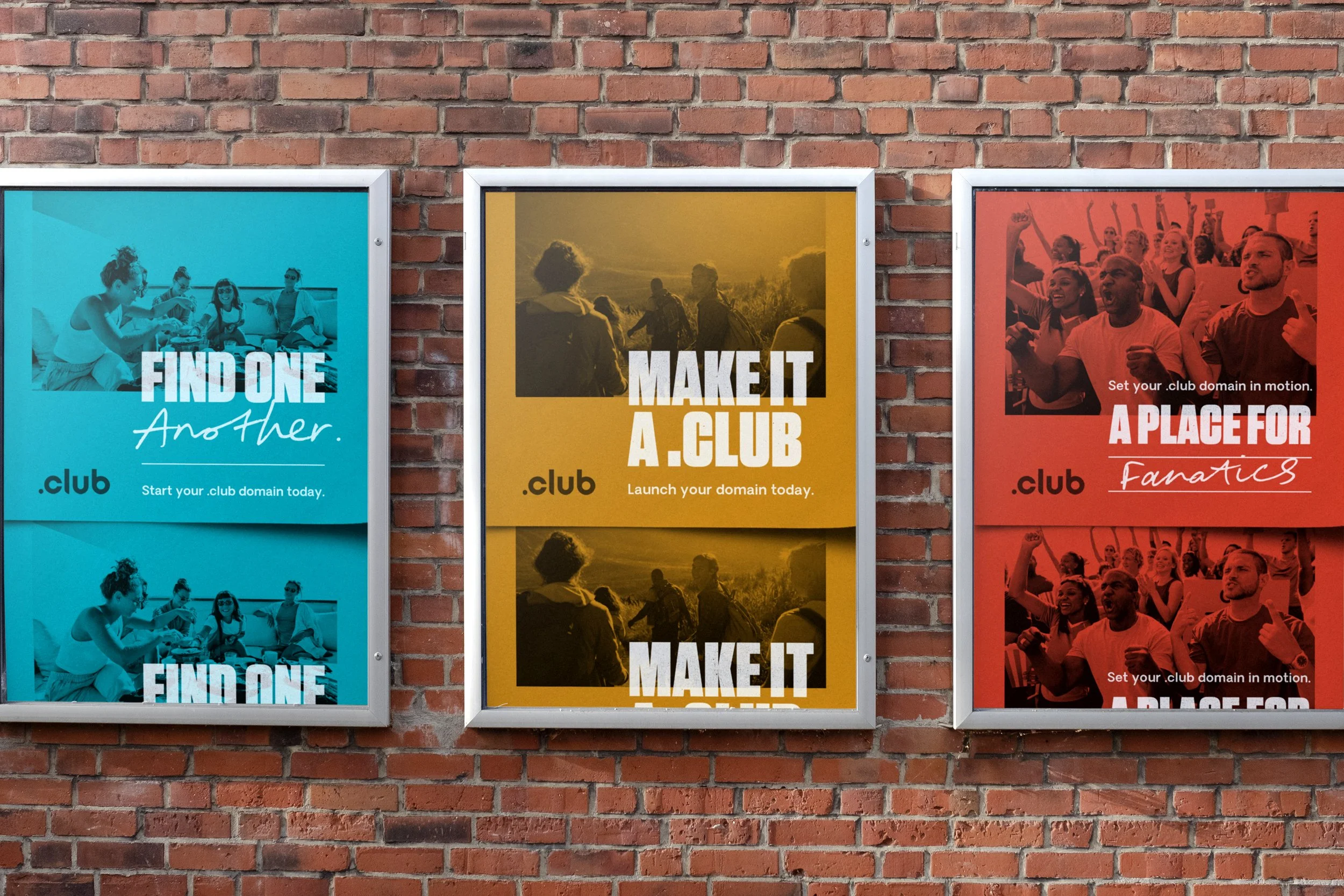
The creative direction leaned into a lo-fi, flyer-inspired aesthetic. We took cues from old pin boards and street posters layered over each other, where color, type, and texture signal different groups and personalities. I used bold color palettes as the foundation, treating each execution like its own modern flyer. The layouts felt tactile and slightly raw, but still intentional and structured.
From there, I built a system that could scale. Color became a unifying thread across touchpoints, while type, framing, and layout rules ensured consistency whether the work showed up on web, social, paid media, or event activations. The lo-fi inspiration gave the brand personality, but the underlying structure kept it cohesive.
At its core, the message was simple: the world is craving togetherness. A .club domain gives people a place to rally, organize, and grow their community. It connects like-minded people, opens doors to new opportunities, and keeps conversations moving. .club isn’t just a URL. It’s a signal that you belong somewhere.